Tokpie is getting a UX/UI deep refresh in a few months with many new useful features. Moreover, with the new interface, users will get a mobile version of the exchange. In this post, Tokpie’s developers will be sharing the upcoming improvements. So, look below to preview the re-design pages. Also, find brief explanations. Don’t forget to open that article tomorrow because the team will be uploading new mockups regularly.
Update Schedule
Such a big update will be completed in four stages.
- First Website (.io) update including main pages improvements will happen between February 01-22, 2022. Done ✔️
- The second Website (.io) update including the launch of the new DAap for listed projects will happen between February 23 – May 30, 2022;
- Third Website (.io) update including the launch of the voting DAap for upcoming projects will happen in June-August, 2022;
- The update of the trading platform (.com) will be happening from April to September 2022.
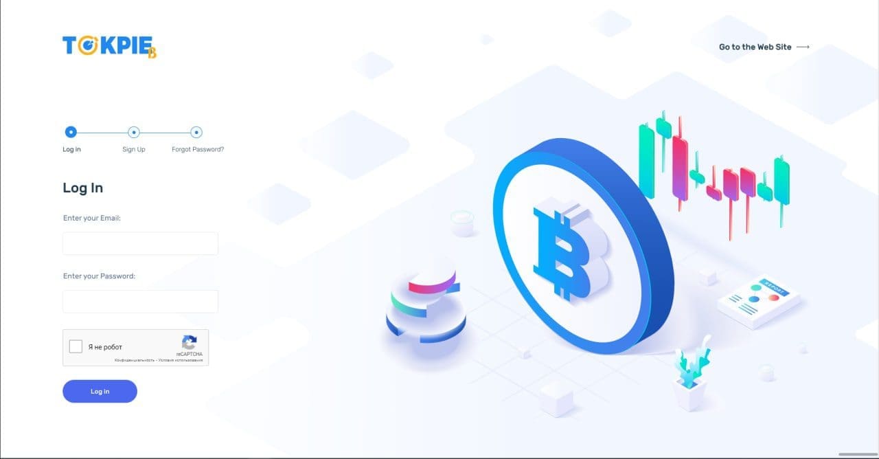
Sign up page
The starting page will look much better – isn’t it?-)
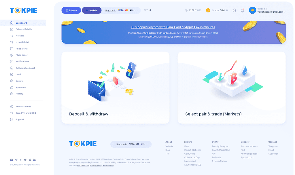
Main page
The new main page will become much more user-friendly than it’s now. Also, look at the Tokpie mobile version below.
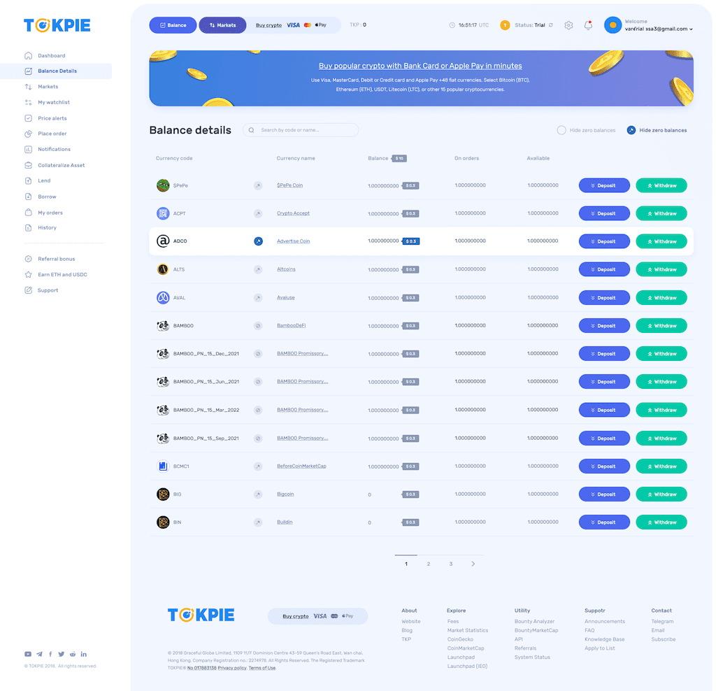
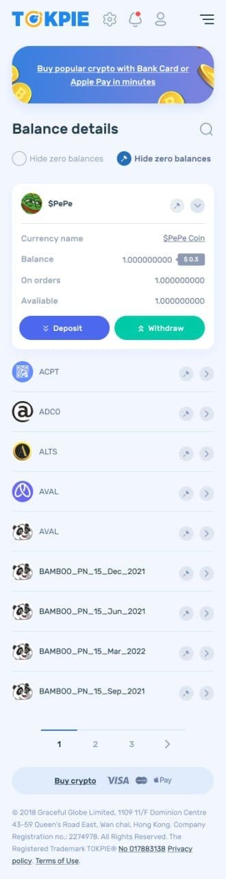
Balance page
Also, users could see USD equivalents of all their assets and $ total balance.
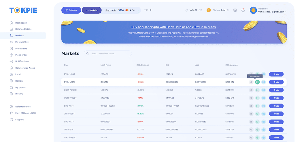
Market page
Simultaneously, the Market page will get a rearranged columns, icons, and a straightforward button to trade. Moreover, having pairs sorted by volume, users could easily find the most liquid assets. Alternatively, they could use a searching bar.
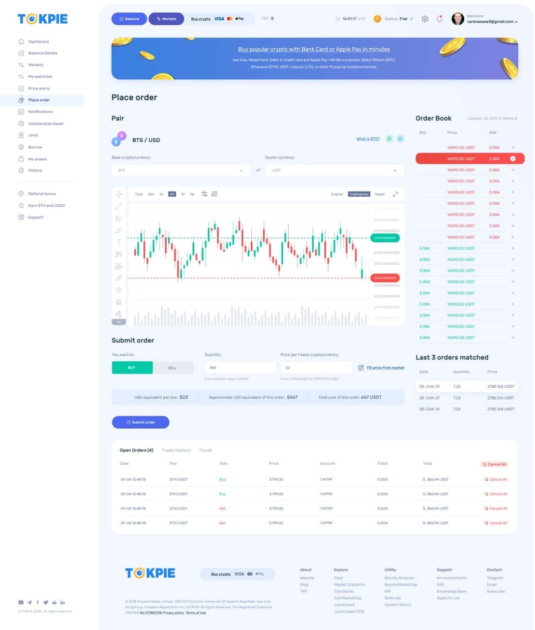
The order book (pair)
The new order book will become much more nice and useful than it was. Also, a user will be able to delete his orders (BIDs and ASKs) just from the Order book panel by clicking on a cross element (right upper corner). Moreover, full stats about opened orders, trades, and funds will be visible below the price chart.
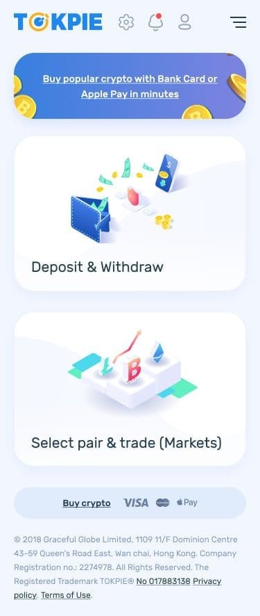
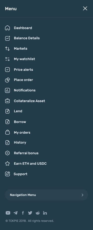
Mobile version
The new mobile version allows users to do all operations by using any mobile phone (even the oldest and cheapest devices). Moreover, a user doesn’t have to download an app from Google Play or App Store. Therefore, people get full freedom.
New Landing page
In addition to the exchange platform – tokpie.com, Tokpie’s developers also update the website – tokpie.io. So, check below how .io pages will look soon.
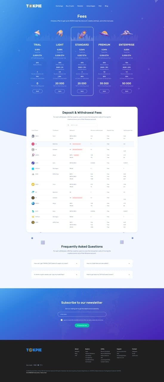
Updated fees page
Thanks to the new design, visitors could check plans, fees, trade, deposit, and withdrawal commissions in a more suitable way. Moreover, people could search cryptocurrencies by name or symbol.
More images of new designs for the desktop and mobile versions are coming. So, stay tuned for the update.
Useful links
- The new Listing form for projects
- Add your Token to the Permanent Default Token List on MEW.
- Also, get a coin listed on Trezor at no cost.
- Then, learn how to Improve Token Circulation Supply.
- Add bank card and Apple Pay: sell more tokens.
For any questions or cooperation, you can contact Tokpie at https://t.me/tokpie.